Surface · 01
Companion
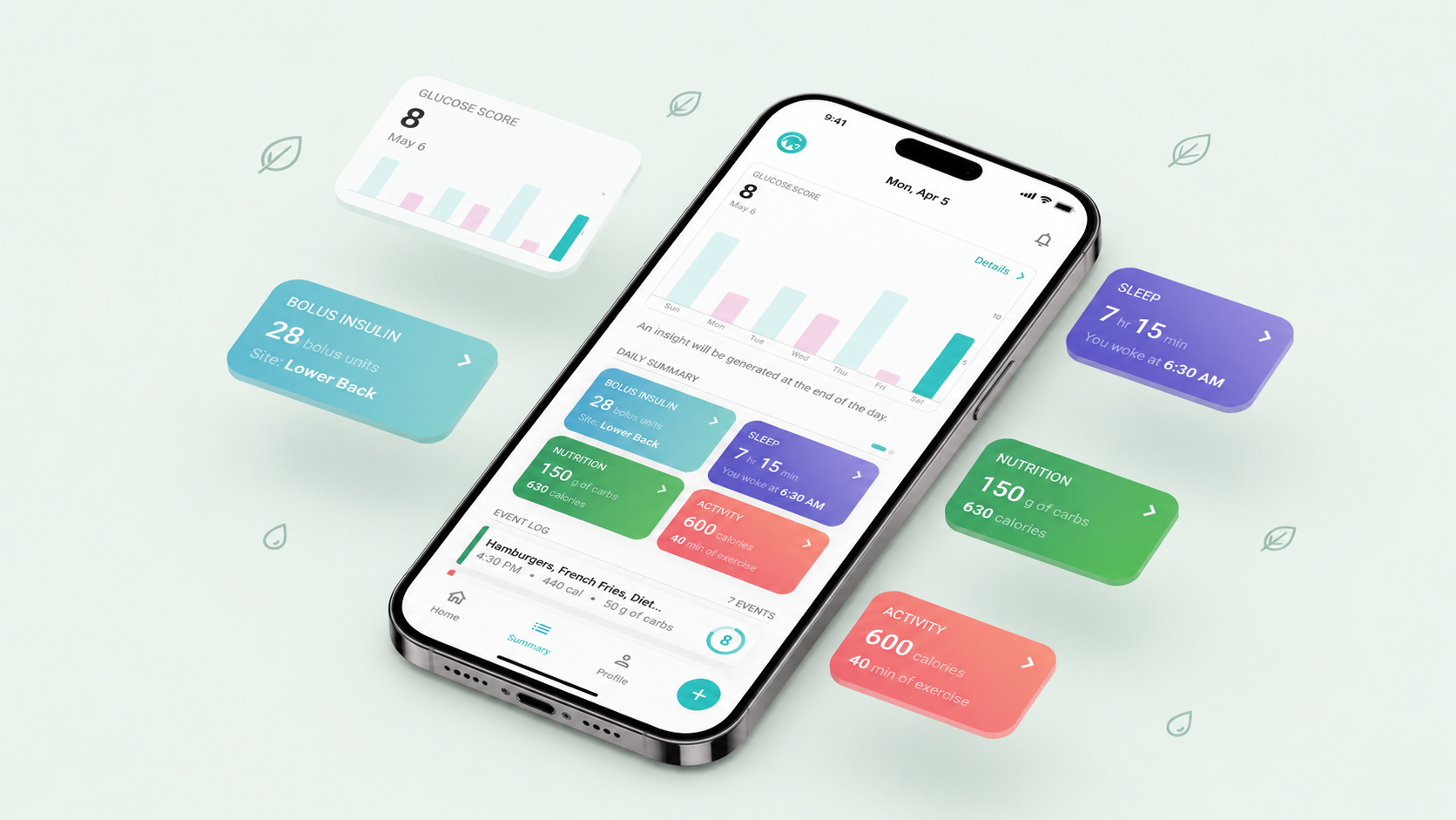
A glanceable status card answers ‘am I okay right now?’ with colour, plain-English verdict, and one suggested action. The chart is one tap below.
A personal CGM companion for iPhone, redesigned from a numbers-only data app into a decision-ready coach people actually open before breakfast.
GlucoSense is a free iPhone companion for continuous glucose monitor (CGM) wearers. The team had a beloved data engine and a loyal niche audience, but first-time users were churning at 62% in week one.
Our brief: rebuild the first-run experience and core dashboard so a non-clinical user could feel oriented in under sixty seconds.
My Role
End-to-end: research, IA, interaction design, prototyping, hand-off.
Duration
14 weeks
Mar – Jun 2024
Platform
iOS 17+
SwiftUI · HealthKit · Dexcom & Libre
Team & Collaborators
1 Designer, 2 iOS Eng, 1 Clinical Advisor, 1 PM/Founder
Methods Used
Tools
Figma · FigJam · Maze · Lookback · Mixpanel · Notion
CGMs stream a glucose reading every minute — 1,440 data points a day. GlucoSense v1 surfaced all of them in dense line charts borrowed from hospital dashboards. Power users loved it. Everyone else asked the same three questions in support tickets: ‘Is this number good? What did I do wrong? What do I do next?’
“I open it, I see a squiggle, I close it. I don't know what I'm supposed to feel.”
68% of new users could not name their target range without checking settings.
Spike alerts arrived without context, training users to silence notifications by day three.
The dashboard answered ‘what’ but never ‘so what’ — users left without a decision.
A mixed-methods discovery: a 14-day diary study with 12 CGM wearers (Type 1, Type 2, metabolic-curious), 8 follow-up depth interviews, a teardown of 6 competitors, and a quant pass on 90 days of in-product Mixpanel data.

Diagnosed pre-diabetic six months ago. Wears her first CGM. Wants to understand her body without becoming her own endocrinologist.
81% of sessions started within 4 minutes of waking. Users wanted one number, one verdict, one suggestion — not a chart.
People didn't think in glucose, they thought in meals. Charts only made sense when overlaid with food.
‘Time in range’ outperformed any single reading as a confidence signal — yet it was buried three taps deep.
Every interviewee had muted spike alerts. They read them as judgment, not guidance.
| Product | Strength | Weakness | Opening |
|---|---|---|---|
| Levels | Editorial polish, scoring system | $199/mo, food-logging heavy | Sensorless onboarding |
| Nutrisense | Human coach in-app | Coach gating, slow loops | Self-serve coaching |
| Veri | Clean Apple-like UI | Number-first, no narrative | Story over score |
| Dexcom (default) | Clinical accuracy | Built for clinicians, not patients | Translate the data |
We worked in two-week loops. Each loop opened with a divergent FigJam session and closed with five unmoderated Maze tests. We shipped four prototypes, killed two outright, and merged the survivors into v2.
Replaced ‘show all data’ with ‘answer one question per session.’ Built a decision tree of the five questions users actually asked.
Prototyped a single Status card — colour, verdict, suggestion — backed by a collapsible chart. ‘You're steady’ beat ‘In range’ by 31%.
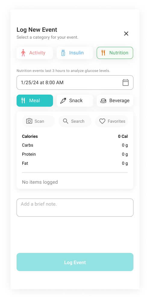
Moved meal logging from a buried tab to a primary tile. Pre-filled with Apple Health and recent meals to keep entry under 6 seconds.
Rewrote every system notification with our clinical advisor. Removed the word ‘spike.’ Added a ‘What might have caused this?’ trail.
Power users revolted in beta. We compromised: kept the verdict-first card by default, added a one-tap ‘Show the data’ that remembered the preference per user. Power-user NPS recovered within two weeks.
Our first round skewed metabolic-curious. A late-stage T1 panel surfaced edge cases (post-bolus drops) that forced a v2.1 patch. Should have stratified the panel from day one.
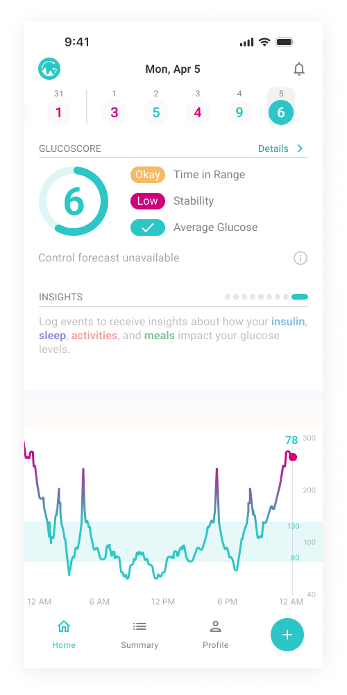
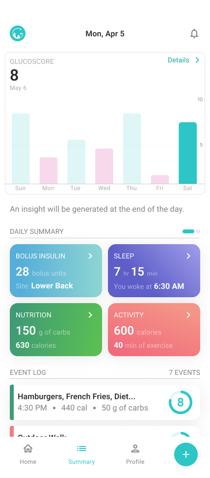
A glanceable status card answers ‘am I okay right now?’ with colour, plain-English verdict, and one suggested action. The chart is one tap below.
Photo, voice, or recent-meal entry in under six seconds. Each meal is auto-correlated with the glucose response — cause and effect, not just numbers.
A weekly digest written like a friend: ‘Tuesdays are your steadiest days. Late dinners after 9pm cost you 14% of your range.’
Cause and effect, not just numbers.
Final hi-fi Figma prototype with 38 connected frames, used for the last two rounds of moderated testing and engineering hand-off.
“Finally a glucose app that talks to me like a human. The morning card is the only health thing I open every day.”
“I stopped being scared of the alerts. I actually read them now.”
The single highest-leverage decision was replacing a number with a sentence. It changed every downstream interaction.
The first-run flow became our highest-signal place to test new metaphors — cheaper than usability sessions, faster than interviews.
Patients want a human tone with clinical rigor underneath. Our advisor reviewed copy weekly to keep both intact.