Surface 01
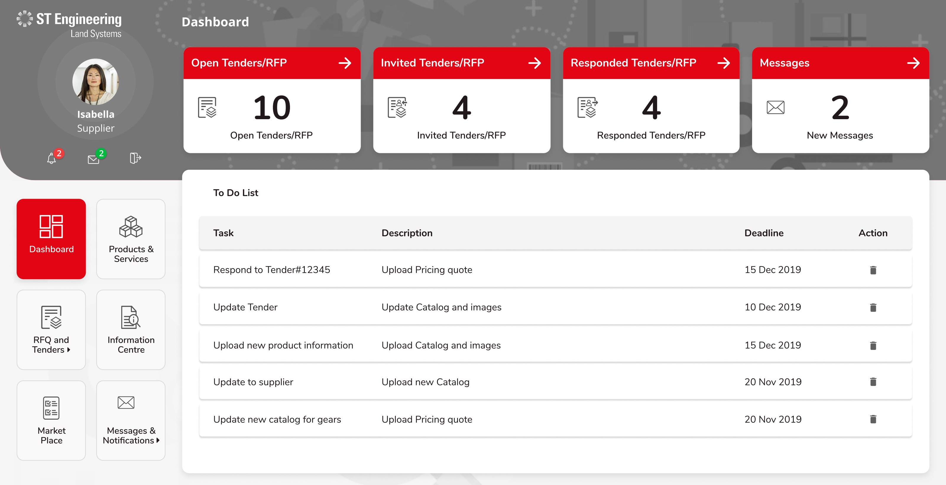
Supplier Dashboard
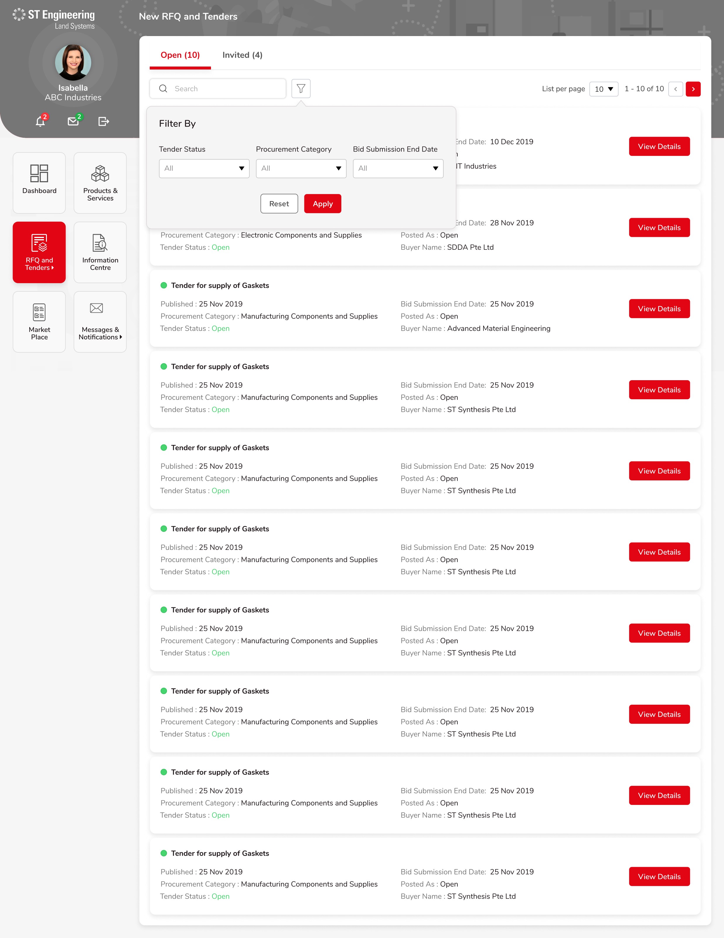
A single glance at Open, Invited, Responded RFQs and unread messages — the four numbers Isabella opens the app to check.
ST Engineering Land Systems · Procurement
ST Engineering Land Systems' procurement programme ran on four disconnected portals — Buyer, Supplier, Manager and System Admin — plus a long tail of email and Excel. We redesigned them into a single, audit-grade workspace where a tender is one object from publish to award.
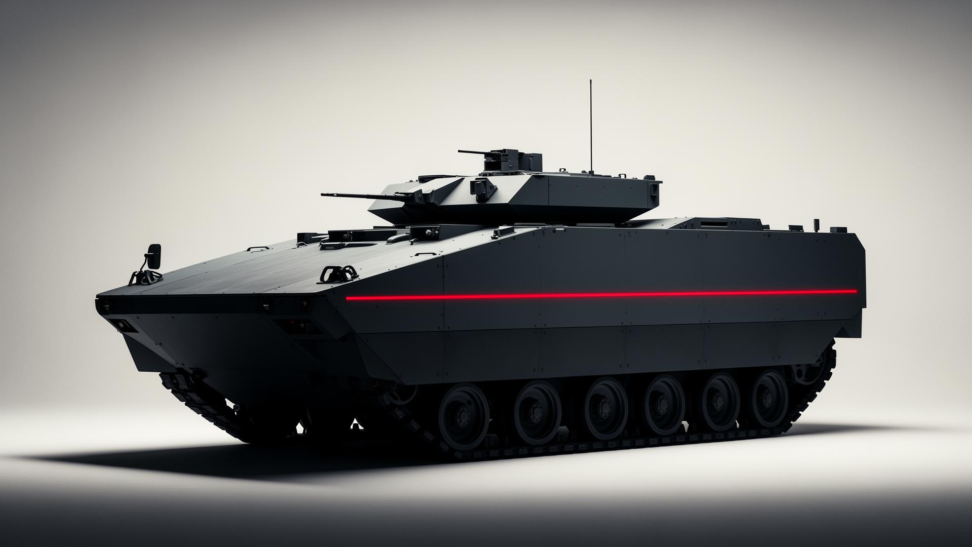
KDM, ST Engineering Land Systems' procurement arm, had grown a different portal for each role and a different process for each portal. The brief was deceptively simple: one tender, one truth — across buyer, supplier, manager and auditor.
Design a procurement workspace that a buyer can defend, a supplier can trust, a manager can govern, and an auditor can read in chronological order.
My Role
Lead UX Designer
Research, IA, interaction, prototyping, design system, hand-off.
Duration
32 weeks
Sep 2019 – Apr 2020
Platform
Web · Responsive
4 role-based portals
Team
1 Lead UX · 1 Visual · 1 PM · 4 Full-stack Eng · 1 QA · 1 KDM SME
Methods
Stakeholder interviews · Tender shadowing · IA card-sort · Wireframes · Hi-fi prototypes · Moderated usability
Tools
Adobe XD · Sketch · InVision · Zeplin · Jira · Confluence
KDM published RFQs by email, suppliers replied with PDFs, buyers rebuilt comparison tables in Excel, and the auditor reconciled it all in a spreadsheet at month-end. Every role believed in a different version of the same tender.
Buyers, Suppliers, Managers and Admins each had their own portal — same tender data, four different shapes, four sign-ins.
Quotes returned as PDF attachments; price comparison was rebuilt in Excel for every tender. Audit trail lived in inboxes.
Onboarding required a long email chain with KDM. 58% of registrations stalled before the first RFQ — capability data never reached buyers.
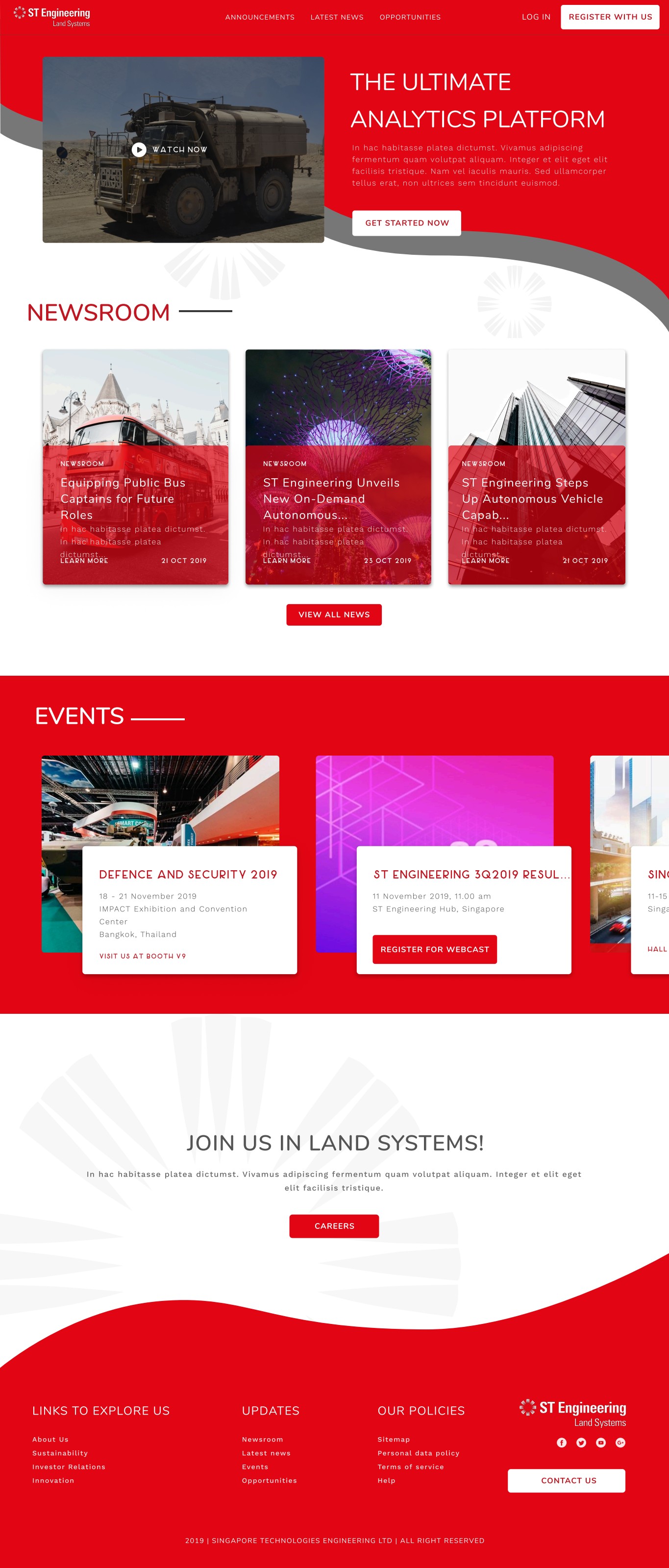
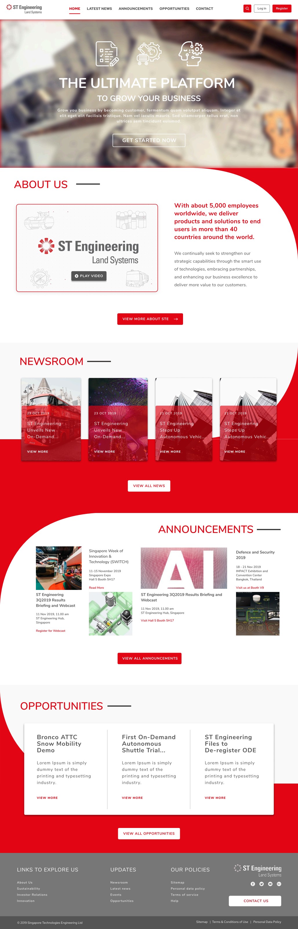
Over six weeks we shadowed three live tenders end-to-end, interviewed 14 suppliers across Singapore, Malaysia and India, sat with 6 KDM buyers and 2 auditors, and audited 4 incumbent procurement tools.
Every role — buyer, supplier, manager, auditor — orbits a single RFQ. We organised the IA around the tender, not the role.
Buyers don't decide on the supplier page. They decide on the side-by-side. We made price comparison a first-class surface, not an export.
13 of 14 suppliers interviewed had abandoned a portal because they couldn't tell if a quote was received. Status had to be glanceable.
System Admin needed who-did-what-when as a readable timeline per supplier, filtered by date — not a dump of rows in a CSV.
Buyer · KDM Procurement
“I just need the five quotes in one table so I can defend my pick.”
Supplier · Abc Industries
“Tell me you got it. I don't need a portal — I need a receipt.”
Manager · Supplier Admin
“Approving a supplier shouldn't take three screens and a spreadsheet.”
System Admin · Audit & Compliance
“If it isn't traceable to a person and a timestamp, it didn't happen.”
We worked backwards from a single shared timeline — Publish, Invite, Respond, Compare, Award, Audit — and forced every screen, in every portal, to belong to one stage. Roles got their own front door; the back room was one shared system.
We drew one timeline — Publish → Invite → Respond → Compare → Award → Audit — and snapped every screen, in every portal, onto a single stage.
Kept four role-specific entry portals (security, branding, mental model) but unified the data model, components, and patterns underneath.
Open · Invited · Responded · Awarded · Closed became a single coloured chip used identically on every screen, every role, every email.
Promoted the buyer's comparison table from a hidden export to a tab. One row per supplier, one column per line item, totals and L1/L2 access tier inline.
Re-cut System Admin from a flat table into a per-supplier story — grouped by date, named actor, plain-English action — exportable but readable first.
The Compare stage — the buyer's price-comparison table — became the design centre of gravity. Everything before it earns the comparison; everything after it executes the decision.
The final system ships as four role-scoped portals on a single design system — a shared component library (40+ tokens, 22 components), one status vocabulary, one tender object, one audit trail.
A single glance at Open, Invited, Responded RFQs and unread messages — the four numbers Isabella opens the app to check.
One tender, three tabs: Details, Responses, Price Comparison. The same shell for buyers and suppliers — only the verbs change.
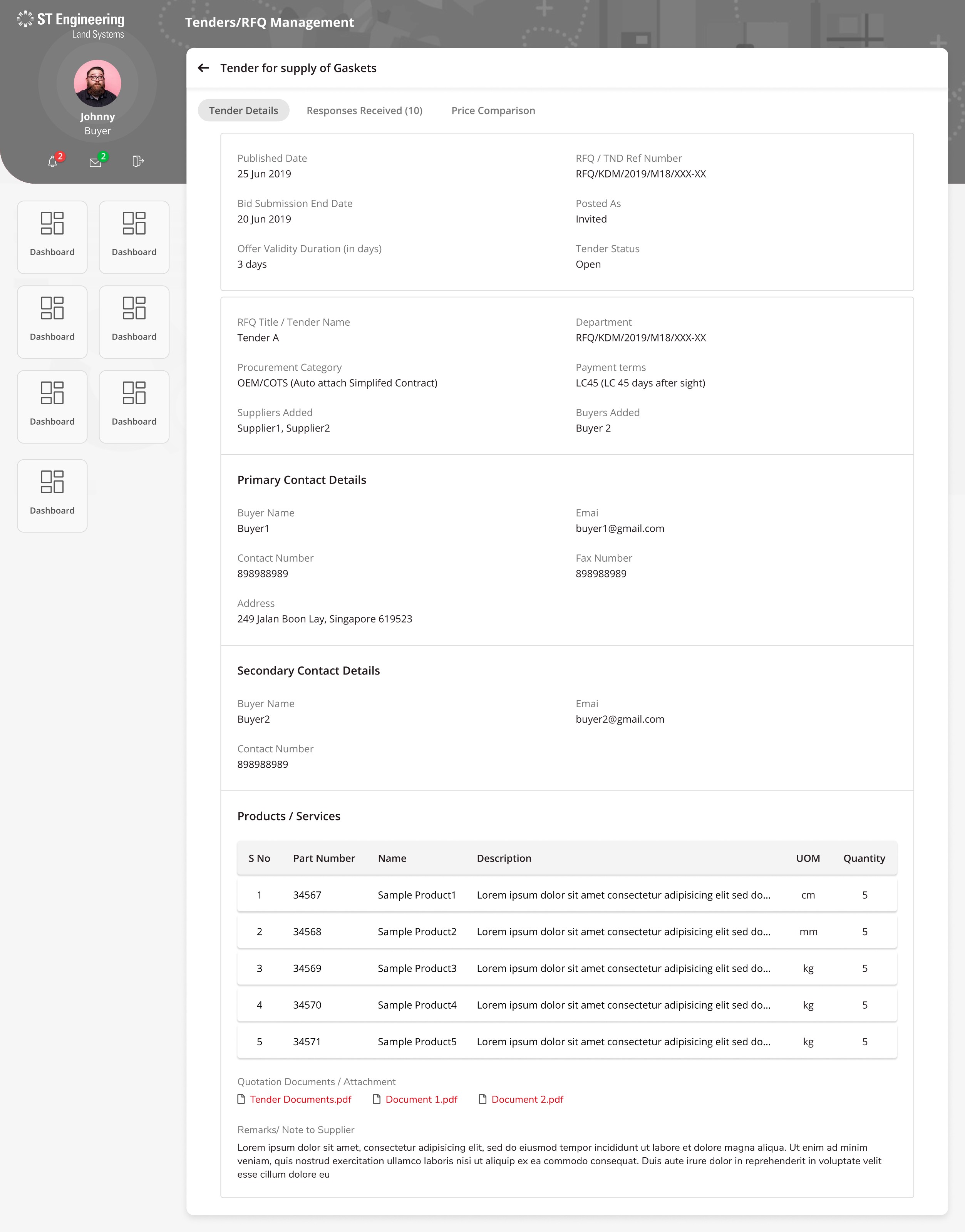
Every contractual field — payment terms, Incoterms, validity, contacts, BOM — laid out in a defensible, printable, audit-ready sheet.
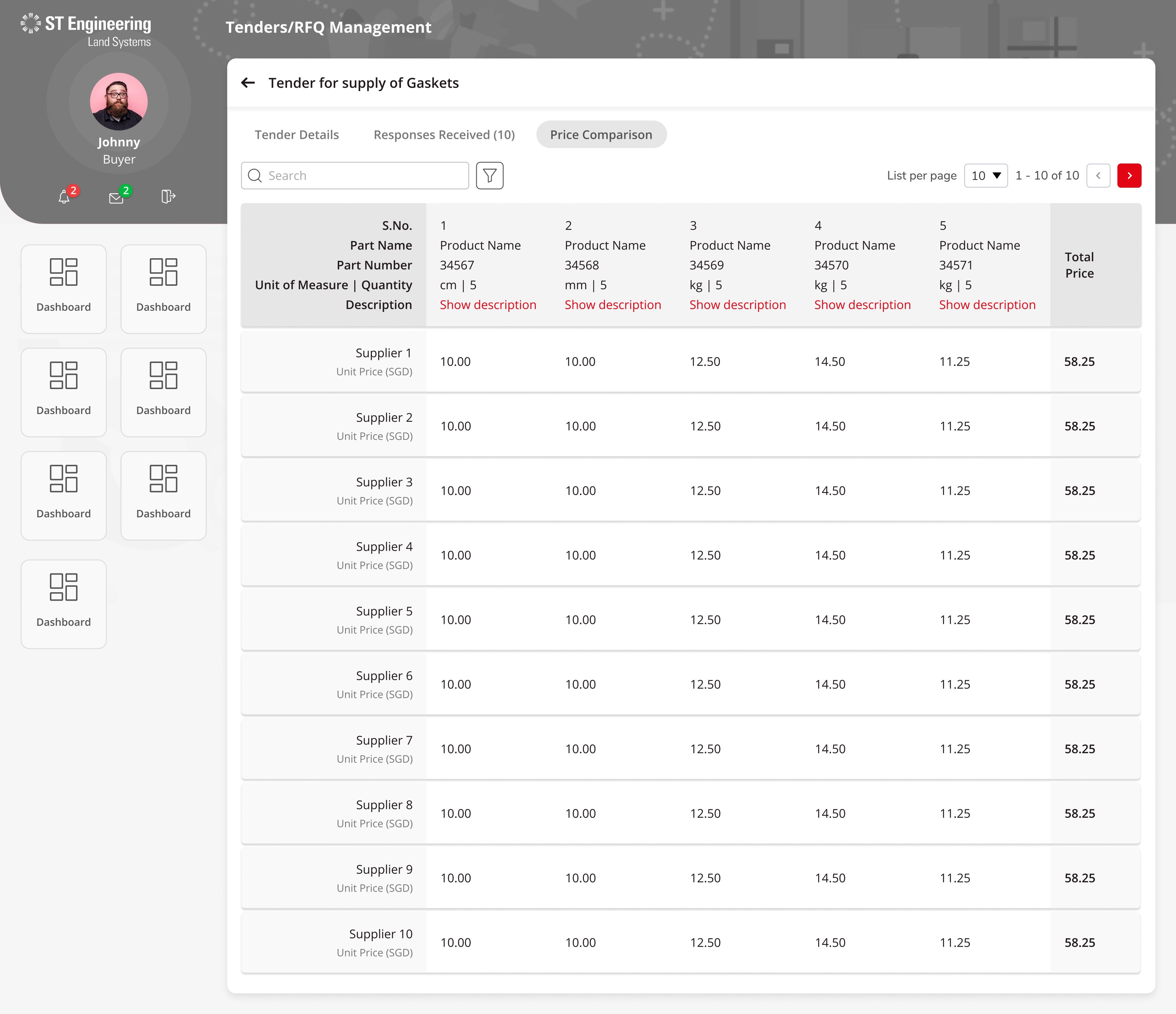
Ten supplier responses side-by-side, line by line, with totals and L1/L2 access tier. The award decision happens on this single screen.
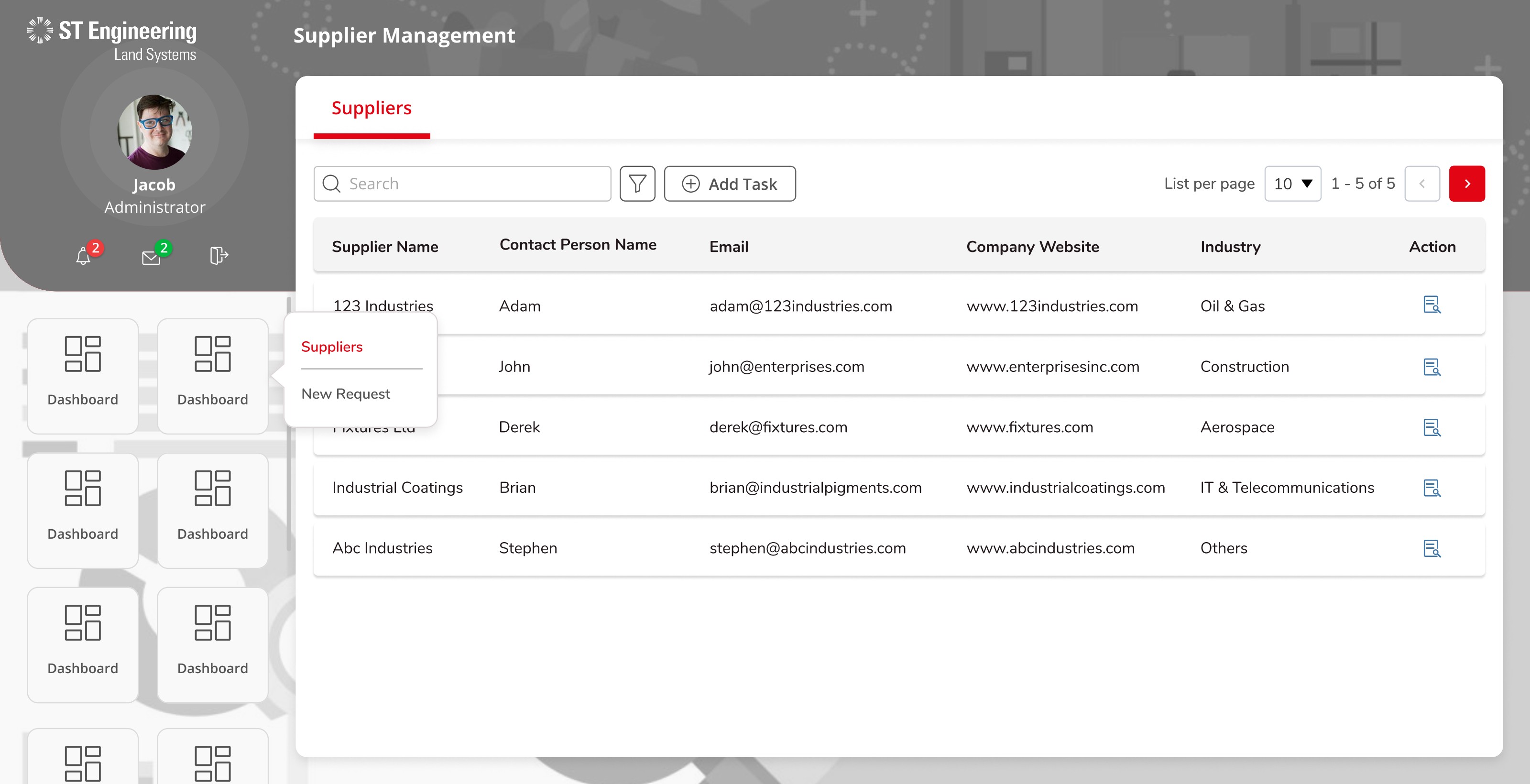
A searchable register of every supplier, with inline tier upgrades and a secondary-contact tab — replacing a four-step admin form.
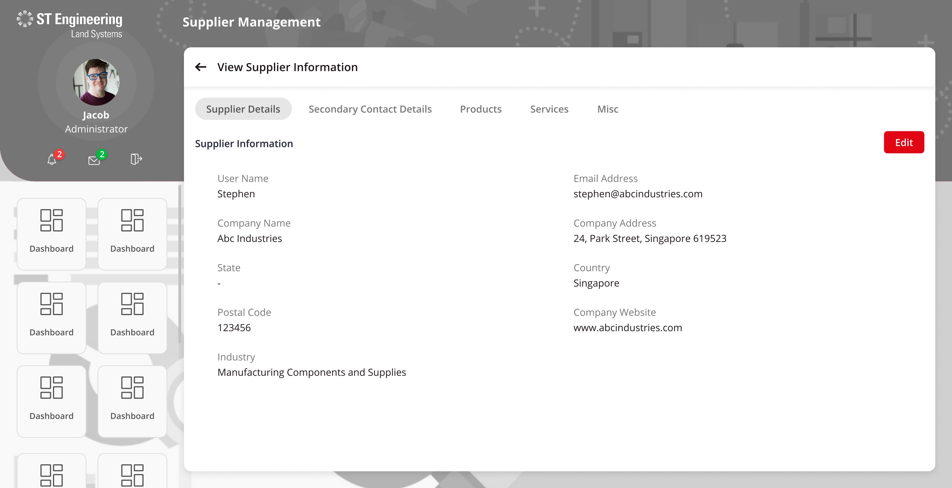
One sheet, five tabs — Details, Secondary Contacts, Products, Services, Misc — the whole supplier relationship on a single URL.
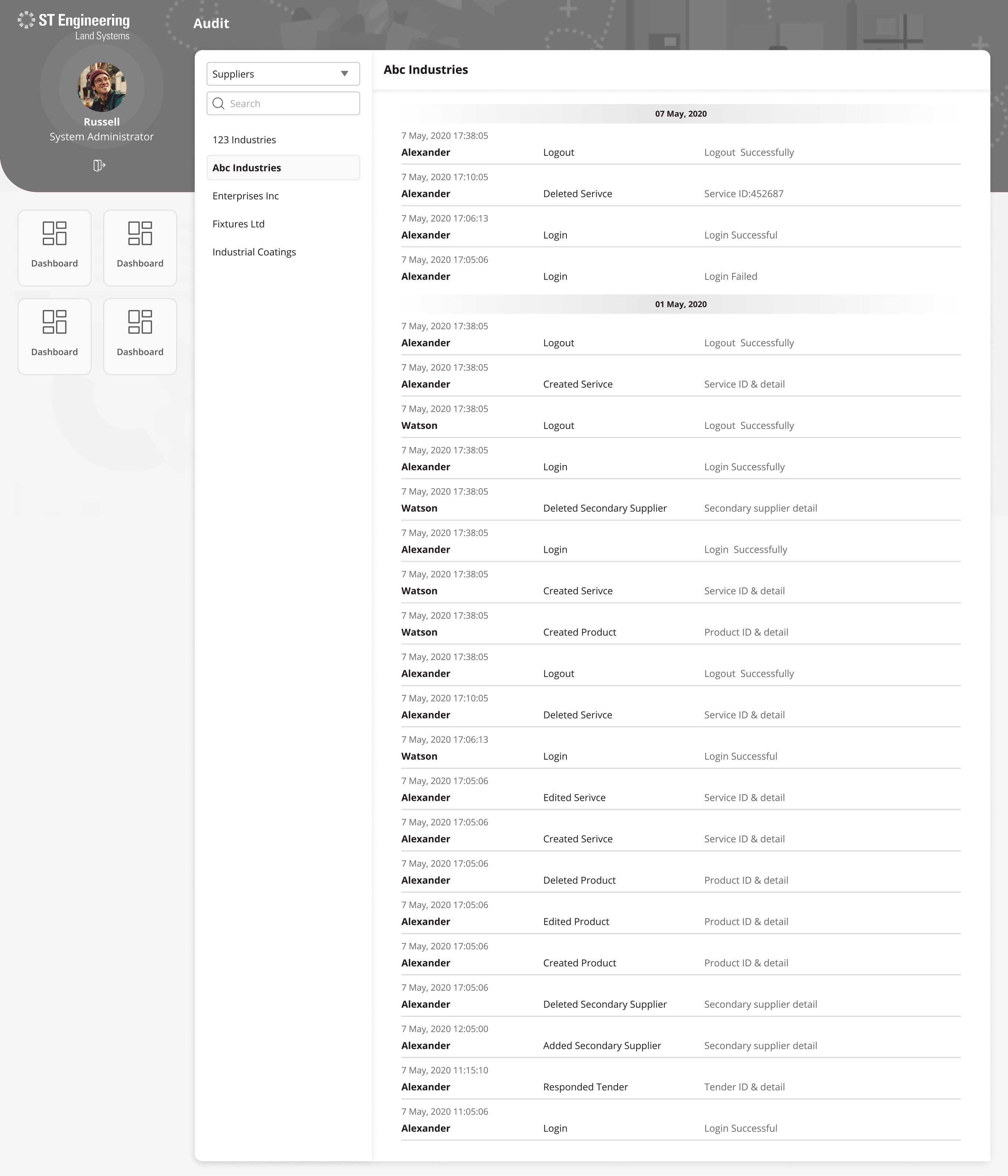
Per-supplier, per-day, per-actor: Login, Created Service, Deleted Product, Responded Tender — a readable story instead of a CSV.
Six months after rollout, KDM had retired three internal trackers, suppliers were quoting in-app instead of by email, and the auditor's monthly reconciliation moved from three days to a filter.
“We used to argue about whose spreadsheet was right. Now we just open the tender. The portal is the answer.”
Procurement Lead · KDM, ST Engineering Land Systems
Our users are procurement officers and suppliers — not soldiers. We dropped the camo metaphor on day one and designed for a calm, compliance-grade workplace.
Five words — Open, Invited, Responded, Awarded, Closed — did more for trust than any redesign of the tender form.
Once Russell could pull a clean timeline per supplier, KDM stopped insisting on parallel paper logs. The portal became the system of record.
Ship the audit timeline first, not last. Once Russell trusted the trail, every other change met less internal resistance. The audit log wasn't a compliance feature — it was the trust feature that made the rest of the redesign possible.
Next case study