KAI Suites — Confinement
A calmer fourth trimester, built into the suite itself.
KAI is the first luxury post-baby confinement service designed to feel more like a retreat than a clinic. We redesigned the in-suite experience — concierge, smart-room, routines, baby monitoring — into a single, one-hand companion for sleep-deprived parents.
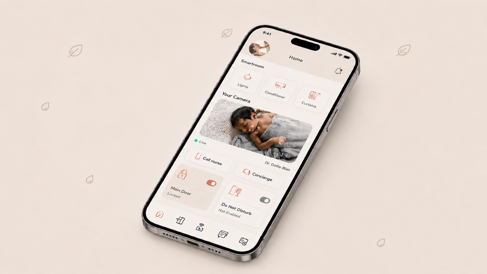
A twelve-week sprint to make a luxury confinement suite feel like home.
KAI Suites is a premium post-baby confinement service spanning prenatal guidance, parental craft, nursing care, lactation, and baby care. The brand had built a beautiful physical space — but the digital experience inside the suite still felt clinical, fragmented, and quietly stressful for first-time parents.
Our brief: design a single in-suite companion that lets a new mother see her baby, control her room, and reach a human — all without leaving the bed.
My Role
Lead Product Designer
Research, IA, interaction, prototyping, hand-off.
Duration
12 weeks
Apr – Jul 2024
Platform
iOS · iPadOS
In-suite tablet + guest iPhone
Team
1 Designer · 2 iOS Eng · 1 Backend · 1 Head Nurse · 1 PM
Methods
Suite ethnography · Diary studies · Co-design with nurses · Usability · Wizard-of-Oz
Tools
Figma · FigJam · Lookback · Maze · Notion
A clinic in hotel clothing.
KAI's first-of-its-kind luxury offering — prenatal guidance, nursing care, lactation, baby care, concierge — was hidden behind paper menus, a TV remote, and a room phone. The brand promised calm; the room delivered cognitive load.
A clinic dressed as a hotel
Suites felt premium, but every digital touchpoint — TV remote, room phone, paper menus — felt like a hospital ward.
Concierge as a bottleneck
78% of nighttime requests were small (light, temperature, water). Mothers waited 4–7 minutes for a nurse to walk in.
Anxious first nights
New parents wanted to see the baby, dim the lights, and call for help without leaving the bed — three apps and a remote made that impossible.
Four nights, four quiet truths.
Over three weeks I shadowed nurses across two shifts, ran 12 in-suite interviews with mothers in their first 14 days postpartum, and coded 4 weeks of concierge chat logs with the head nurse.
The bed is the cockpit
83% of in-suite time was spent within arm's reach of the bed. Anything off-bed — switches, thermostats, intercoms — went unused after day two.
One verb at a time
Sleep-deprived mothers asked for one action per session. Nested menus and dashboards were abandoned within 10 seconds.
Trust travels through the nurse
Guests trusted the nurse, not the brand. Anything the nurse demoed got used; anything the brochure introduced did not.
Concierge is emotional, not transactional
Chat logs read like therapy, not room service. Tone of voice mattered more than response speed for satisfaction scores.
Julia, 32
First-time mother · Day 6 post-delivery
"I just want to see the baby, dim the lights, and know someone is coming — without sitting up."
- —Feel safe, not monitored
- —Bond with baby
- —Get real rest
- —Talk to a human, not a portal
- —Three apps, one remote
- —Cold clinical tone
- —Slow nighttime help
- —Hidden package benefits
Competitive landscape
From fourteen touchpoints to one bedside companion.
We ran four 2-week loops: Frame → Sketch → Prototype → Test in-suite with a real mother and her nurse. Every loop ended at a bedside, not a meeting room.
Frame the suite as one product
Mapped 14 disconnected touchpoints (remote, phone, paper, web) into a single in-suite app on a bedside tablet and personal iPhone.
Verb-first home screen
Replaced a dashboard with five verbs guests actually said out loud: See baby. Call nurse. Set the room. Order. Rest.
Concierge as a person, not a portal
Rewrote every script with the head nurse — warmer tone, named replies, response in under 90 seconds, no service tickets visible to the guest.
Smart-suite without the smart-home cliché
Single bedside control for light, climate, curtains and door — tuned to maternal scenarios (Feeding, Sleep, Visitor, Do Not Disturb).
Onboarding as an invitation, not an intake form.
Three short cards introduce KAI as a hospitality experience first and a clinical service second — a tone the rest of the product inherits.
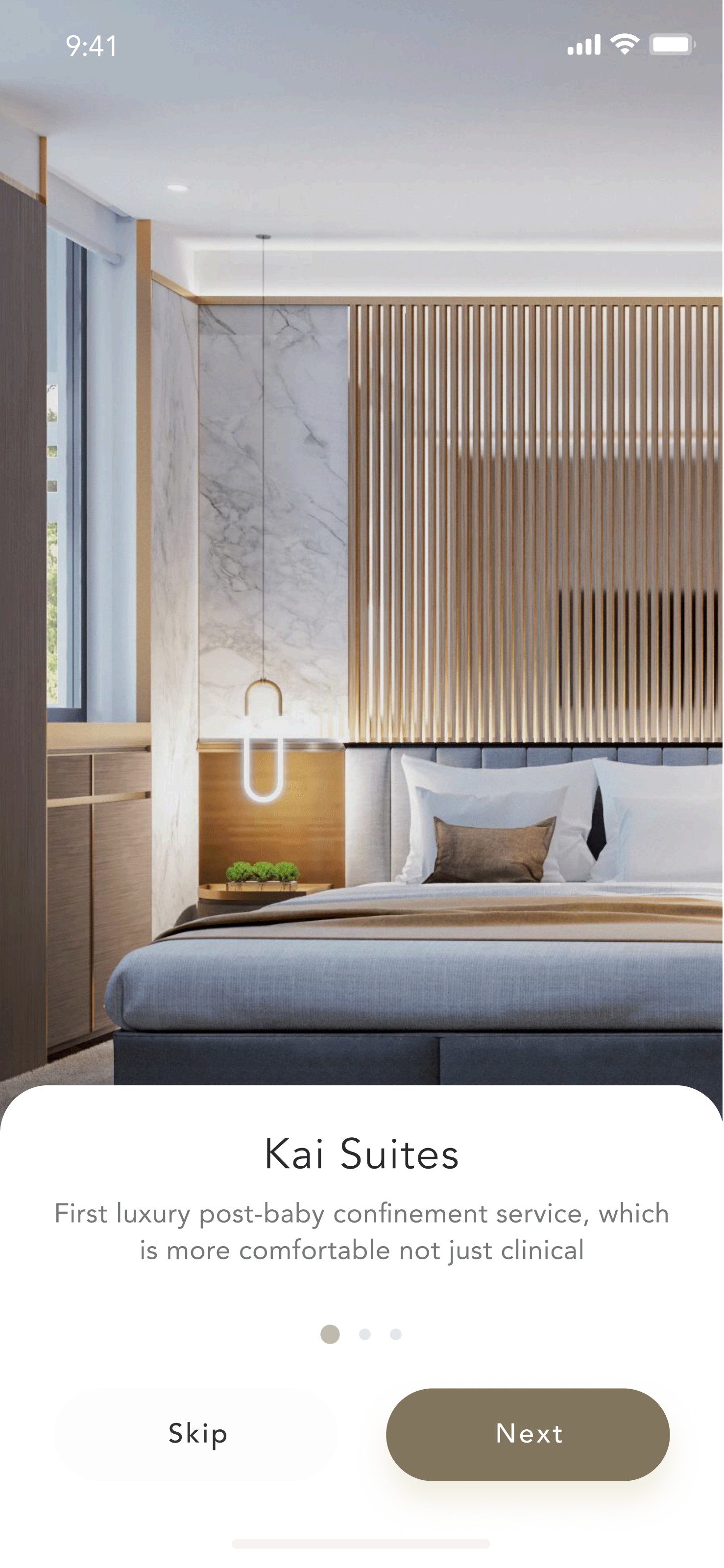
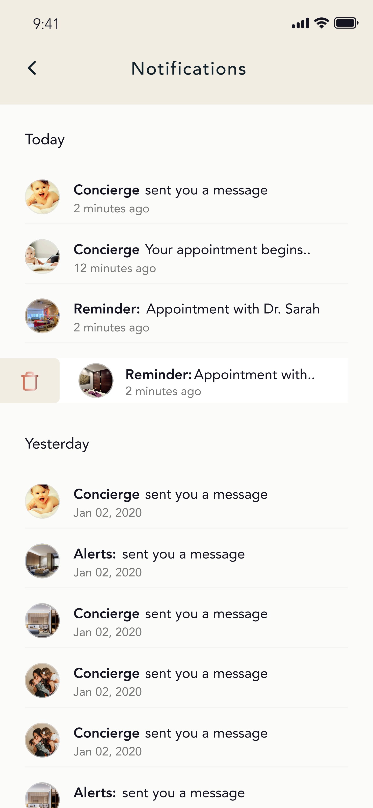
Five surfaces, one calm room.
The final product is a single in-suite companion built around five guest verbs. Each surface earns its place by being usable with one hand, in the dark, at 3 a.m.
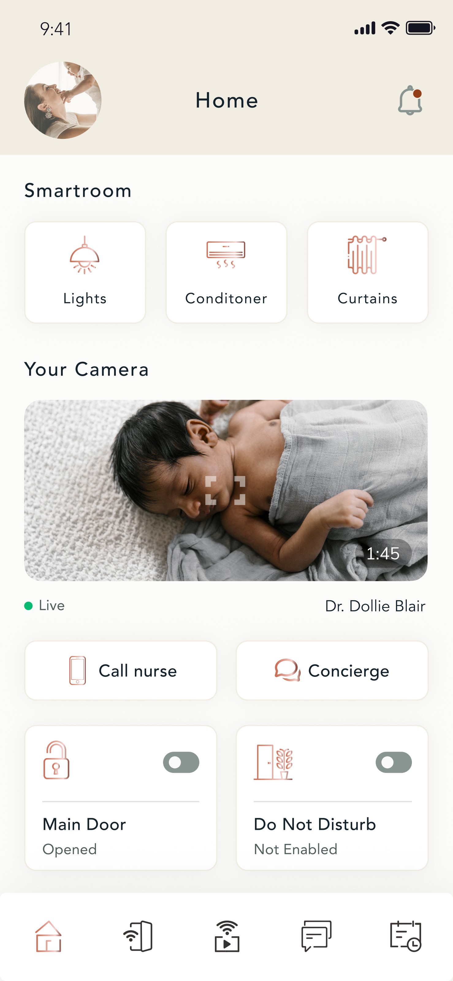
Companion Home
A glanceable bedside home — live nursery camera, the assigned doctor on call, room status, and a single tap to summon a nurse without ever opening a menu.
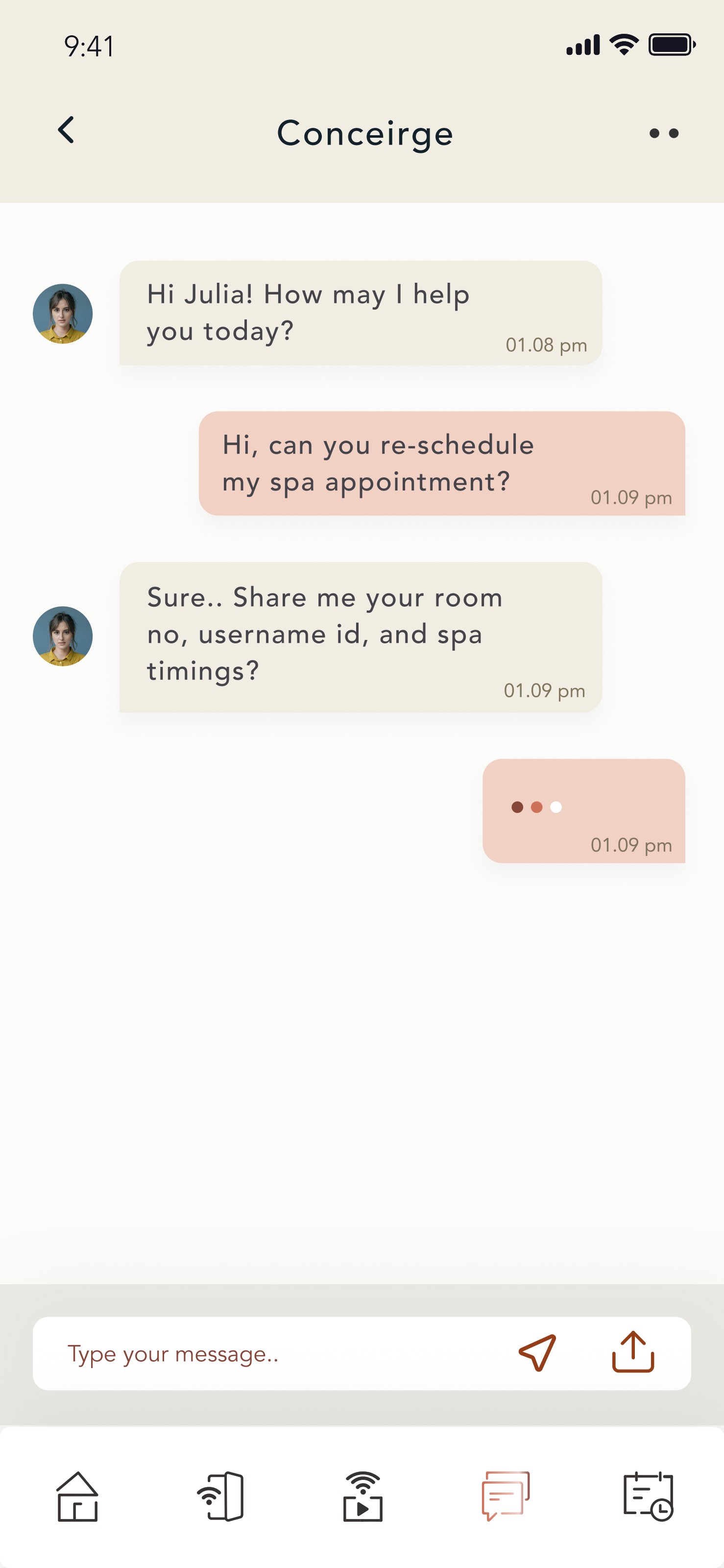
Concierge as a conversation
A named concierge thread that feels like texting a friend at the front desk — spa, limousine, dining, housekeeping — with warm scripts written with the in-house team.
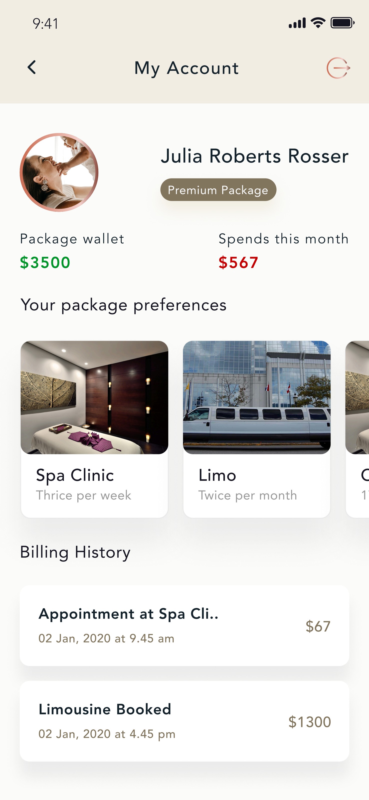
My Account & Package
A clear wallet for the premium package — what is included, what has been spent, and what is left — replacing the brochure mothers were too tired to read.
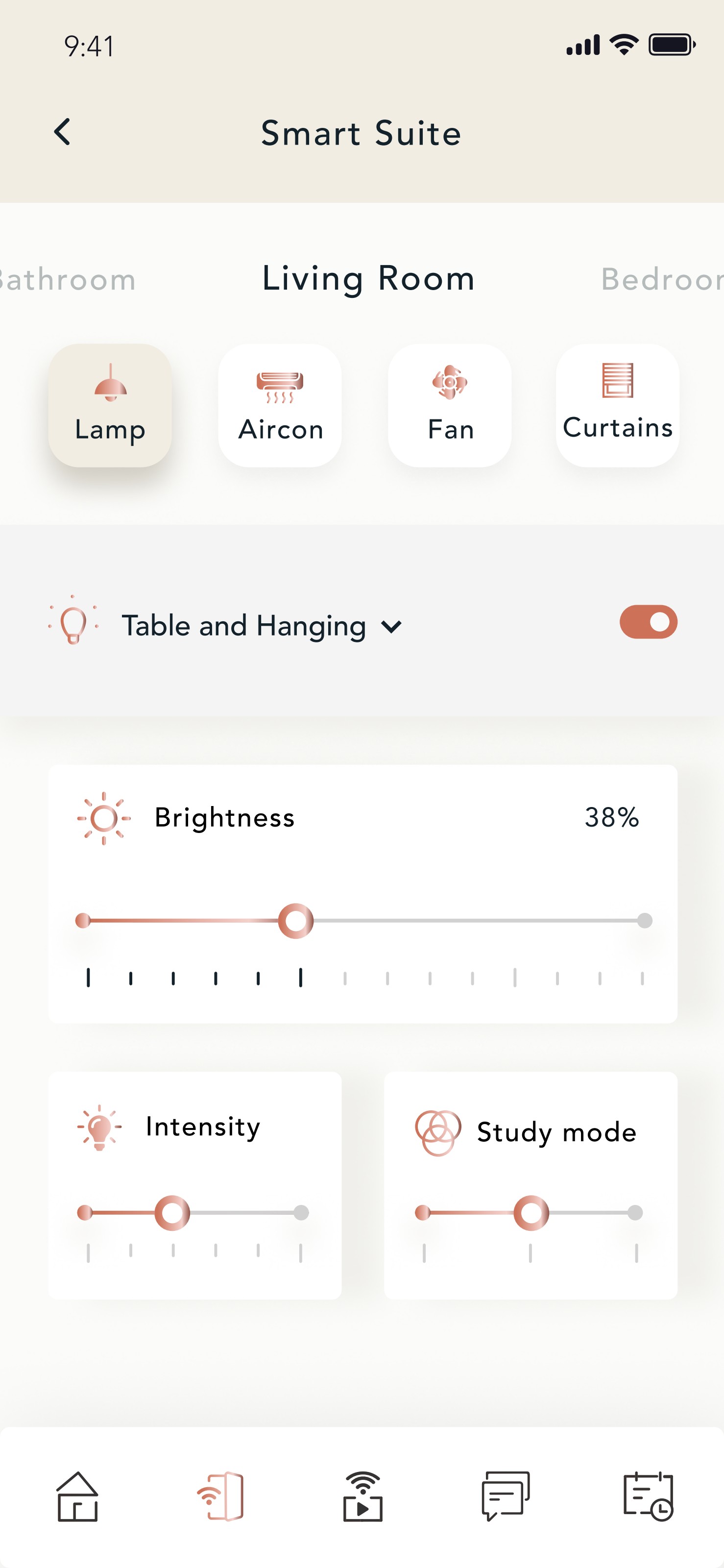
Smart Suite
Lamp, aircon, fan and curtains under a single bedside control — with maternal presets (Feeding, Sleep, Visitor) so a tired mother does not have to think in degrees.
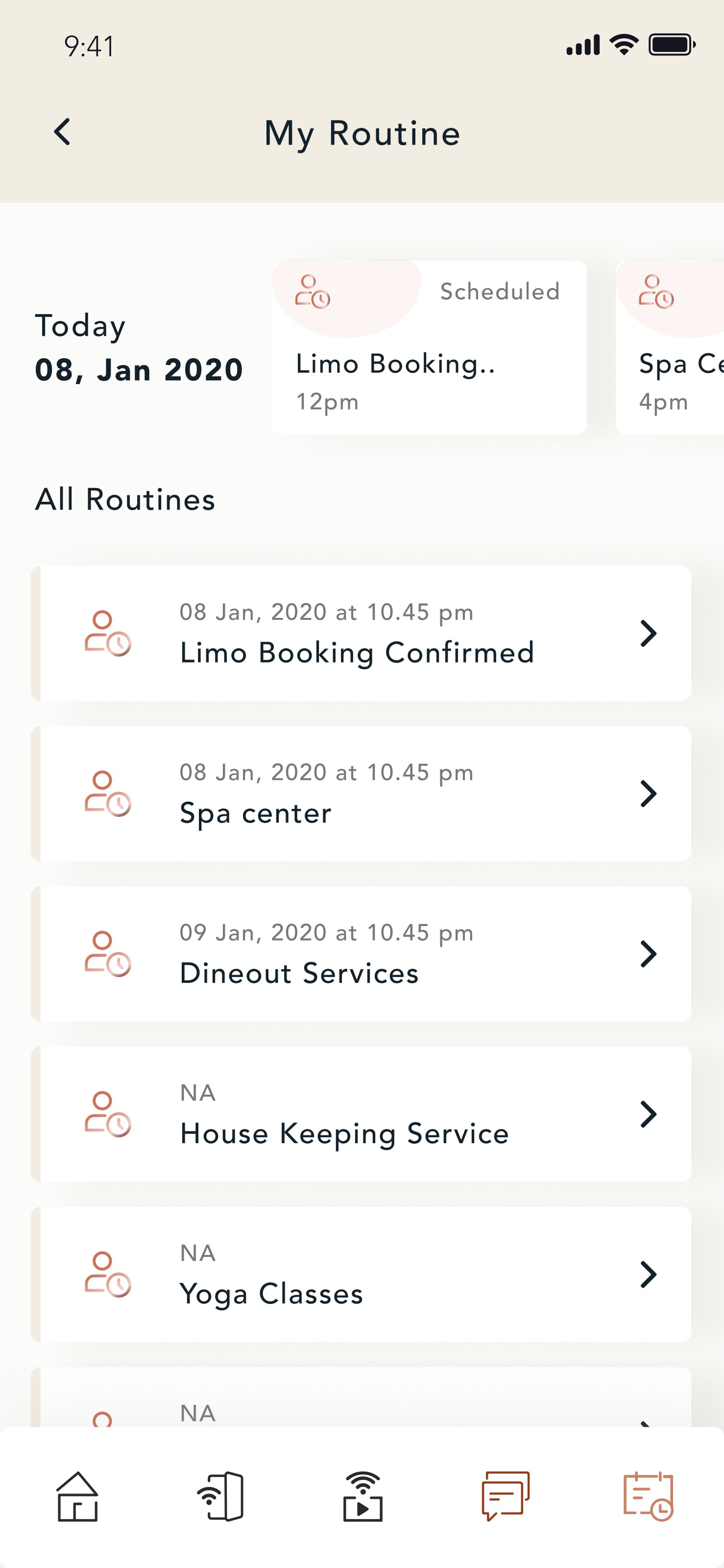
Routines & Notifications
A daily routine view that turns a complex confinement schedule — appointments, spa, dineout, yoga — into a single calm timeline with gentle reminders.
A warm, residential palette — not a clinical one.
Copper, burning sand and beige gradients replace the cold blues common to clinical UI. The system is built on three temperature tokens — Skin, Suite, and Service — that map directly to how a nurse describes the room.
Quieter nights. Brighter reviews.
Measured across the first 90 days post-launch on a cohort of 128 guests, comparing against the prior paper-and-phone baseline.
On my first night I called the nurse twice. By the third, I just tapped twice on the tablet and the lights, the music, and the help arrived together. It is the most thoughtful thing in the suite.
What I would do differently
Postpartum design is removal, not addition.
Every screen we cut earned more trust than every screen we added. The product got better as it got smaller.
Nurses are the real design system.
Co-writing copy and flows with the head nurse out-performed any usability lab. The voice was already in the building.
Luxury is the absence of friction.
Guests did not want more features — they wanted the same five things to work, beautifully, at 3 a.m., with one hand.